I started working with LockNet as a temp in 2011. After my temporary contract expired, the staffing agency I worked through encouraged me to apply for a temp-to-hire position as LockNet’s administrative assistant. I worked in this position for a little over a year before making my transition to sales and marketing. This transition was right in the middle of the massive LockNet rebranding project of 2012. This move was the single biggest brand related change LockNet had ever implemented. Over the years departments had been added, the website was built, tweaked, and ‘updated,’ but the image LockNet was portraying didn’t capture the innovative minds that make us amazing.
The decision was made to overhaul the entire image of the LockNet brand and plans were in place by the time I made my appearance in the marketing world. Thank goodness, because this was going to be a SERIOUS overhaul. Working with a local graphic design firm, Bullhorn Creative, we started from scratch on everything from the company colors, to the logo, to the marketing collateral, to the trade show booth. The goal was to accurately portray the LockNet brand as the innovative, creative, results-driven company that we are. We pride ourselves on our family roots and the values by which we run day-to-day operations, so this was important to display as well.
The overhaul included a shift in digital marketing objective, prompting the birth of this very blog your reading and our bi-monthly newsletter, The Open Door (shameless plug, sign up for our newsletter!). Katie and I started focusing on content rather than talking about how great we are (like I’m doing right now) and creating quality copy that would be appreciated by our readers and potential customers.
The response we’ve seen from the industry as a whole has been nothing we could have prepared for, but it didn’t come without its challenges. Just check out these before and after photos and I think you’ll understand what I mean:
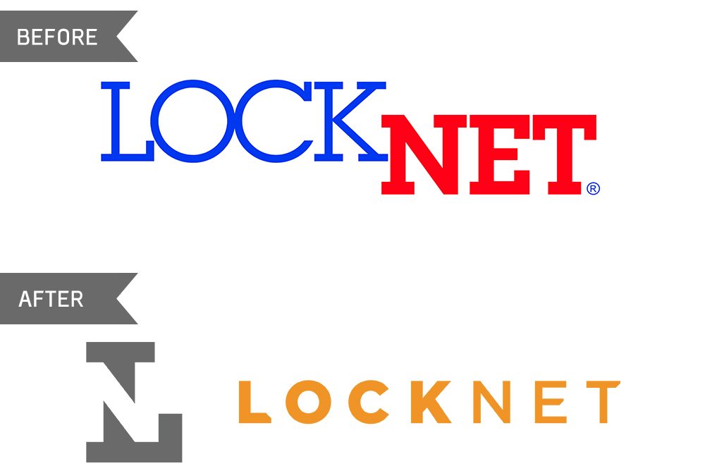
Immediately after choosing a color palette, Bullhorn got to work on the new and improved LockNet logo. The creative utilization of the negative space in the L caught everyone’s eye during the planning session. It didn’t take long for everyone to give this one their seal of approval.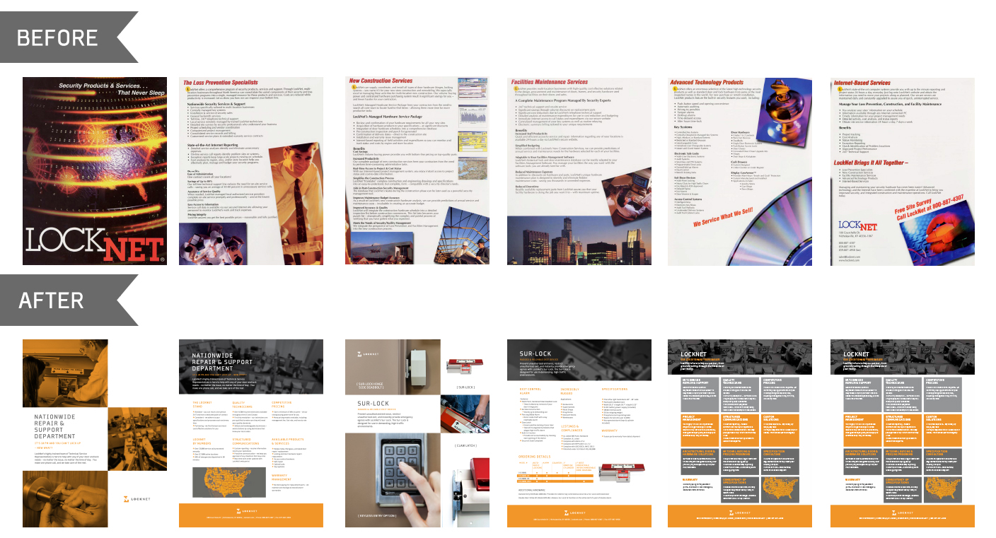 Before we could tackle the massive task of overhauling the marketing collateral we HAD to replace the corporate stock photos that were littering our website and collateral pages. Local photographer, Frank Döring, graced us with his talented eye and lens for an afternoon of photography.
With a folder full of new images to use, it was FINALLY time to tackle the collateral pages. The main goal of the rebrand was updating LockNet’s image to the 21st century, much needed and long overdue, but it was important for everyone involved for our new marketing materials to be clean, concise, and creative. Talk about an improvement. The before hurts my eyes a little now.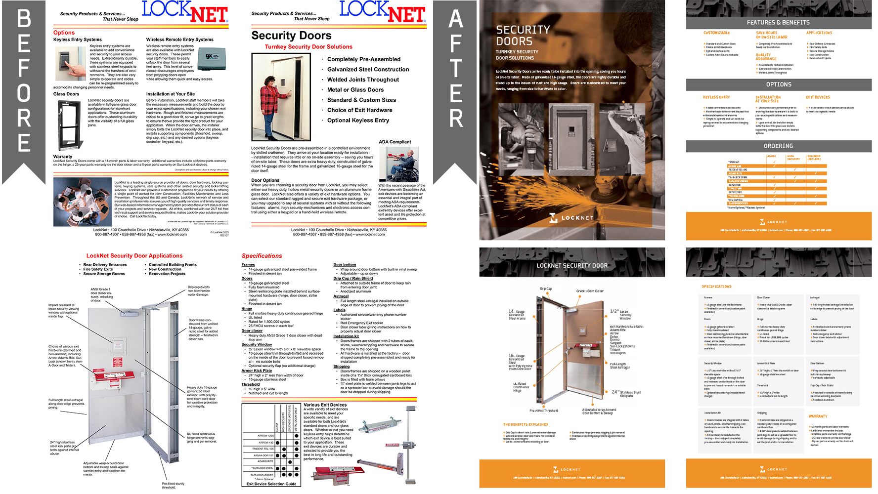 I think this piece captures the most dramatic before and after change I could put on paper. I can’t go without calling out the stranger who came to be affectionately referred to as “Shoulder Pad Lady” on the top left sheet. We all became fond of ‘Should Pad Lady’ over the years, but we developed a sort of love-hate relationship. The security door was easily the first thing on the giant to do list.
What do you think? Did we capture what you image LockNet to be in our massive rebranding project of 2012 or was it a swing and a miss? We’d love to swap rebranding stories if you have some fun ones, I’m sure Katie and I could come up with a never-ending list of “bewares” for anyone about to embark on the process.